
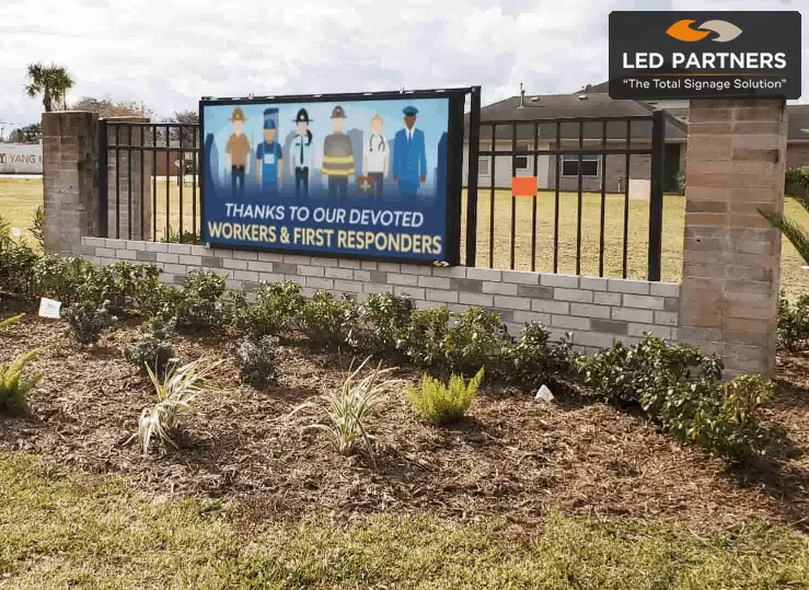
TLDR: Effective HOA community entrance signs start with a clear purpose, a site-specific design, and a realistic plan for approvals, installation, content updates, and maintenance. Boards should compare providers on the complete project’s scope and ongoing support, so the finished sign remains readable, useful, and manageable.
Key Takeaways
A community entrance sign does more than identifying a neighbourhood. It welcomes residents, helps visitors find their way, and shapes the first impression people form before they enter.
For homeowners’ association boards and community managers, signage can also solve a practical communication problem. Well-planned HOA community entrance signs can combine a permanent identity feature with timely updates, clear directions, and a consistent appearance across the property.
Before choosing colours or materials, define the sign’s purpose. It might replace an ageing monument, improve directions, reduce temporary notices, or make announcements more visible.
List and rank the main uses before requesting proposals. This helps signage providers recommend the right type, placement, size, and features.
Common goals include:
A sign focused on identity will need a different layout from one displaying changing messages.
Many communities need more than one sign. A permanent entrance feature can establish the neighbourhood’s identity, while digital displays and wayfinding signs support everyday communication.
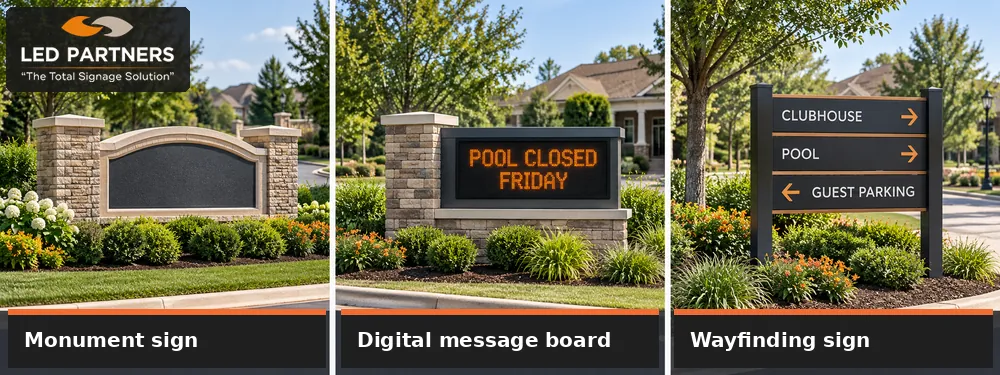
A monument sign is a low, ground-mounted structure that usually displays the community’s name. It may include a logo, masonry, metalwork, dimensional letters, lighting, or landscaping that reflects the development.
The design should complement nearby homes without becoming difficult to read. Letter size, colour contrast, surrounding plants, and distance from the road all affect whether drivers can identify the community in time.
An LED message board lets the HOA share announcements without printing posters or putting up temporary banners. It can display meeting reminders, pool closures, maintenance updates, community events, safety notices, and collection changes.
The sign should be easy to read from the road, with messages sized for passing drivers. The HOA should also establish a simple update process, including who can post, who approves sensitive notices, and who removes outdated information.
Wayfinding signs help residents, visitors, vendors, and emergency personnel navigate the community. They may identify the clubhouse, pool, sports facilities, guest parking, management office, or visitor entrance.
Use a consistent style across the system so people can recognise directions quickly. Repeating the same colours, lettering, symbols, and terminology also gives the property a more organised appearance.
The location often determines whether a sign works. Visit the proposed site at different times, observe it from the direction residents and visitors will approach, and check for trees, parked vehicles, utility cabinets, walls, or road curves that could block the view.
Traffic speed and viewing distance should guide the sign’s placement and design. Faster traffic usually requires fewer words, larger lettering, and stronger contrast, so measure the actual viewing distance and let the provider recommend suitable dimensions and display specifications.
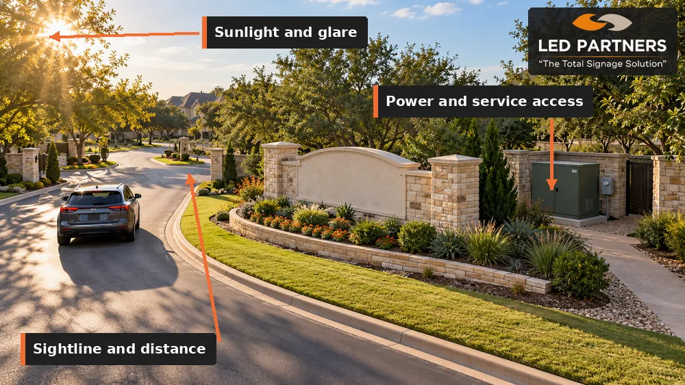
Direct sunlight and glare can make an outdoor display difficult to read. Ask how the proposed sign will perform during the brightest part of the day and whether automatic dimming will adjust an LED display after dark.
Confirm whether the site has suitable power, communications access, drainage, and room for installation equipment. Underground utilities, irrigation lines, landscaping, and vehicle clearance may affect the final location.
Future service access matters too. Technicians should be able to reach the sign safely without removing major landscaping or disrupting the entrance whenever maintenance is needed.
Community entrance signs are often read from moving vehicles, so the message must be understood quickly. Decorative features can support the design, but they should not compete with the community’s name or current announcement.
Use clear type, strong contrast, and enough open space around the main message. Avoid narrow lettering, busy backgrounds, long sentences, and too many colours on one screen.
A roadside message should communicate one main idea at a time. If residents need more detail, direct them to the community website, resident portal, email, or management office.
Effective examples include:
Limit rapid transitions that make drivers wait for the full message. Each screen should remain visible long enough to read comfortably.
The entrance should feel connected to the neighbourhood. Colours, materials, logos, and architectural details should support the character of the community while remaining practical outdoors.
A digital sign stays useful only when its content is current. Assign responsibility to a role, committee, or management team rather than relying on one volunteer indefinitely.
Create simple rules covering approved messages, publishing access, review requirements, display dates, and emergency updates. The process should remain easy to follow when board members or management staff change.
Ask how users will access the software and whether training is included. Board members or managers should know how to publish, schedule, edit, and remove a message without specialist technical skills.
Clarify where to get help when the software, connection, or display is not working. Support after installation can be as valuable as the initial product selection.
Sign requirements vary according to location, dimensions, lighting, mounting, and local regulations. The board should review the HOA’s governing documents and confirm applicable requirements before approving the final design.
Ask the provider what is needed for permitting and site planning. A complete proposal should identify which approvals, drawings, inspections, electrical work, and site preparations are included.
The sign price is only one part of the project. A complete budget may include design, engineering, fabrication, permits, demolition, foundations, electrical work, landscaping repairs, installation, software, training, and content creation.
Ongoing costs may include electricity, software access, cleaning, inspections, replacement parts, and service visits. Asking these details early reduces the chance of bringing an incomplete budget to the board.
Quotes can be difficult to compare when providers include different services. Ask each company to identify the sign type, dimensions, materials, display specifications, installation scope, training, warranty, and support included in the price.
A lower initial price may leave the HOA responsible for permits, electrical work, or site preparation. Compare the full scope and expected ownership costs rather than one total figure.
A qualified provider should explain why a proposed solution fits the site and how the community intends to use it. Its recommendation should connect design and technical choices to traffic, sunlight, content, maintenance, and budget.
Ask providers:
Clear answers help the board understand what it is purchasing. They also reveal whether the provider has planned a complete sign system.
We provide design, fabrication, permitting support, installation, content creation, technical assistance, repairs, and maintenance for LED display projects. Our coordinated service keeps planning, installation, training, and support connected to HOA boards.
We work with monument signs, digital message boards, outdoor LED displays, and community wayfinding. Visit our HOA community signs page or Houston showroom to compare display sizes and resolutions in person.
Good HOA community entrance signs begin with a clear purpose, a careful site review, and a realistic plan for long-term use. When the board understands what residents need to see and how the sign will be managed, it can compare providers with confidence.
Contact LED Partners to request a tailored recommendation.